Most shoppers open a product designer on their phone, so the designer has to work at 360-390 pixels wide without zooming, sideways scrolling or blocked controls. Printcart Store 2.11 reworks the modern design tool for phones. The tab bar fits the screen, the first-run tour can always be skipped, every control is big enough to tap, and the text toolbar stays...
Key takeaways
Why does the mobile experience of an online product designer matter?
A shopper who taps Design online has already decided to personalise the product. That is the highest-intent moment on the whole product page. If the next screen hides a tab, traps them in a tour or zooms the page when they type, they leave, and they usually do not come back on a desktop. Some stores switch the editor off for phones with the Hide design editor on smartphones setting, and customers then see a "not supported on mobile devices" page. With 2.11 there is no need for that on the modern layout.
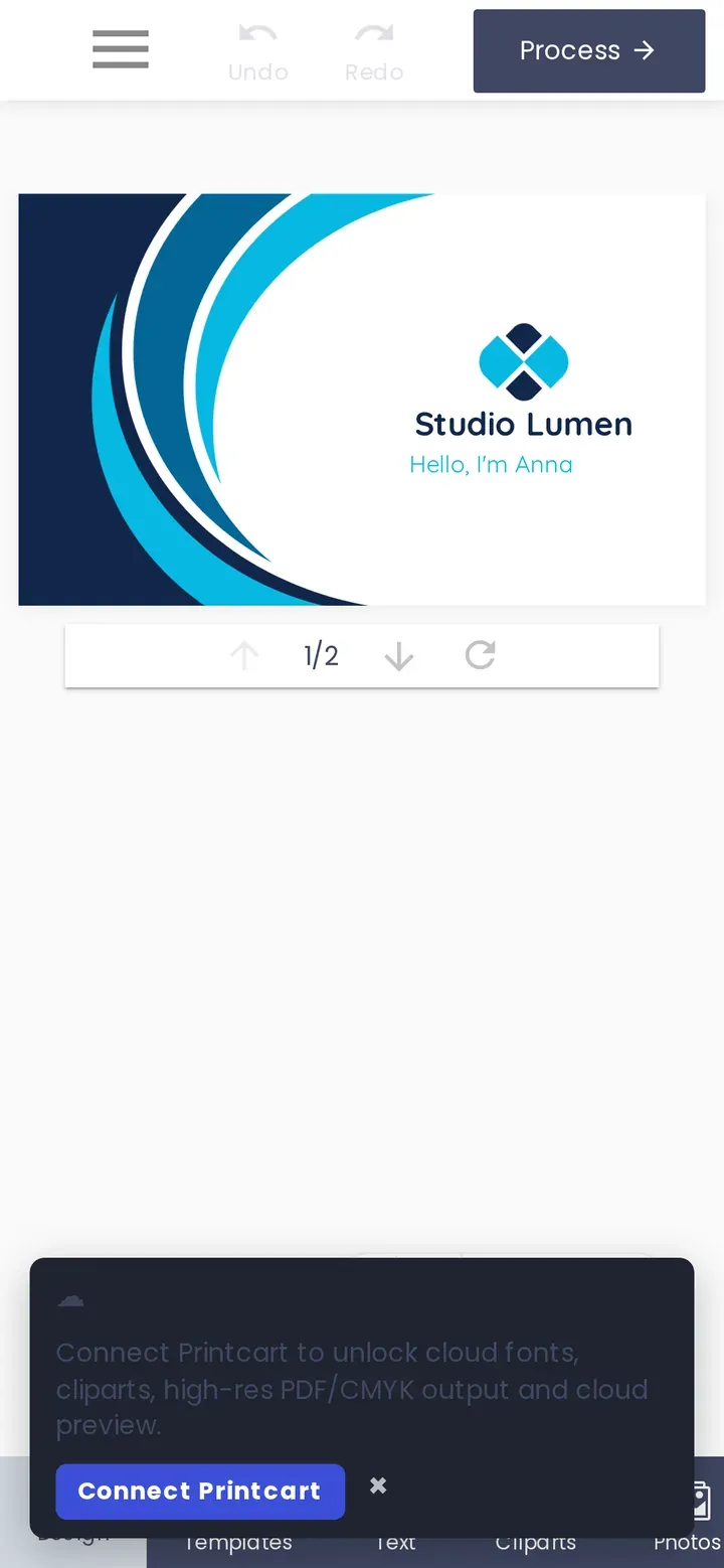
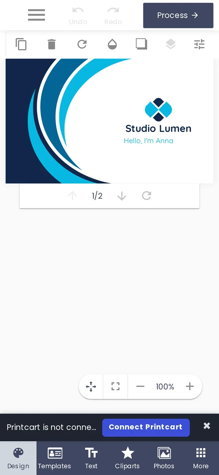
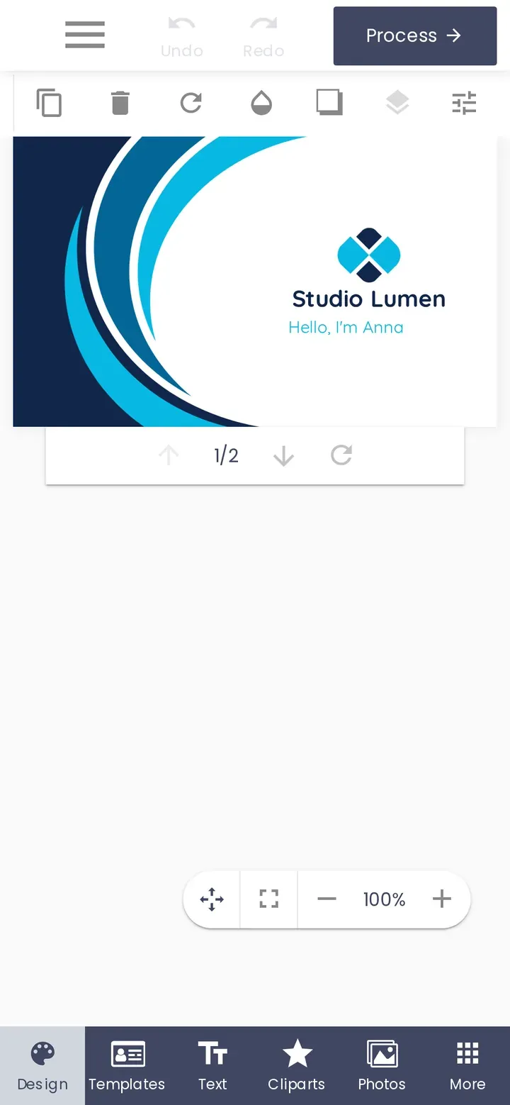
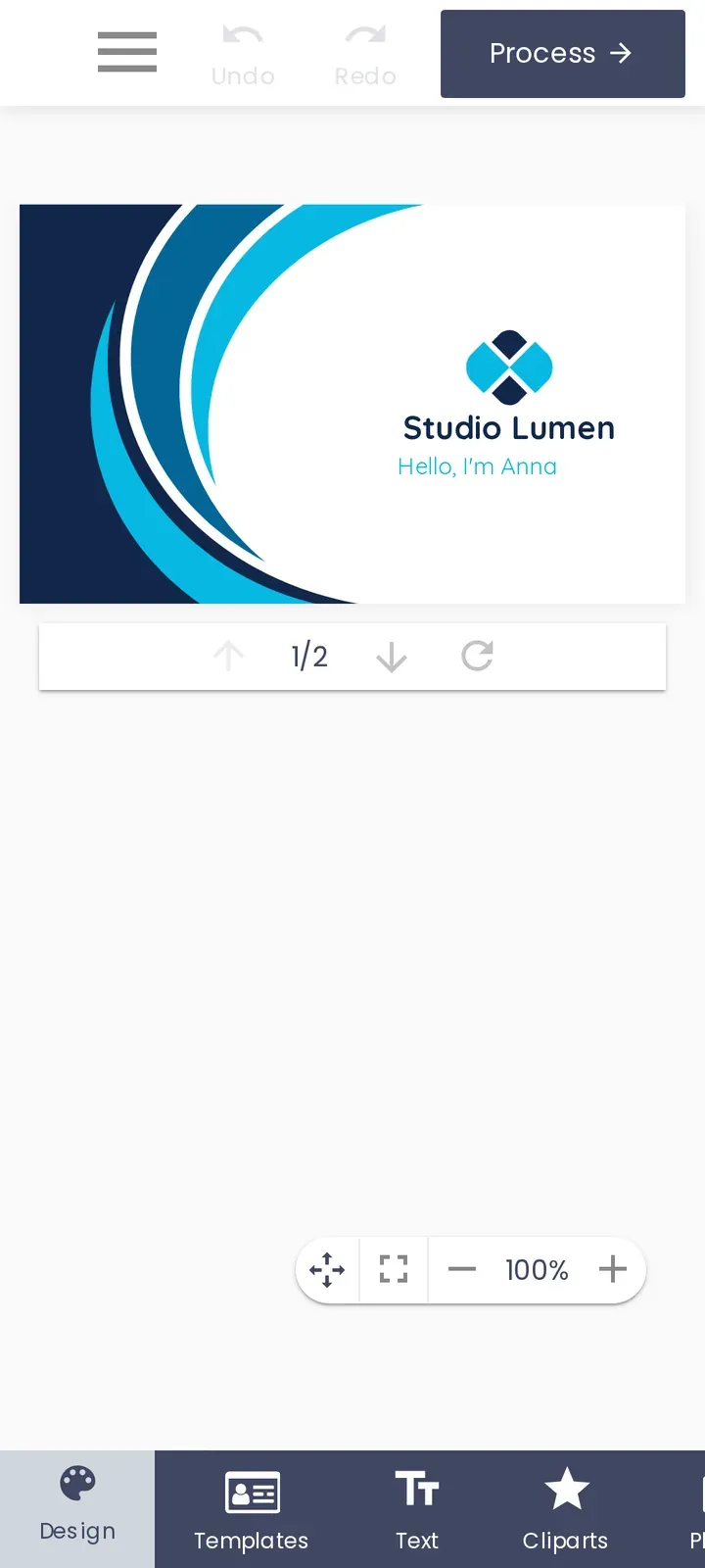
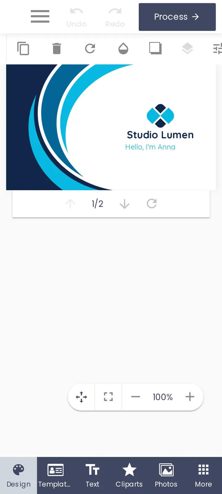
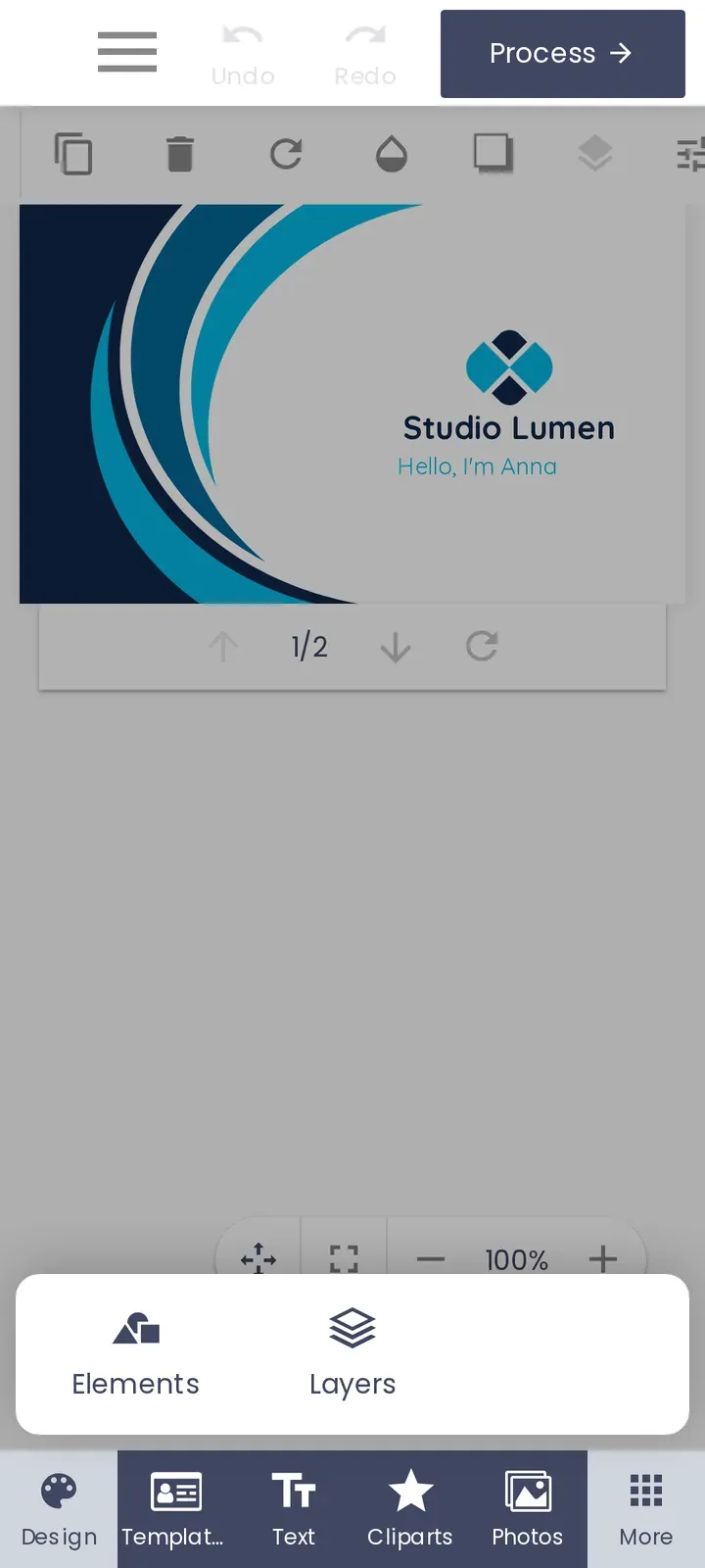
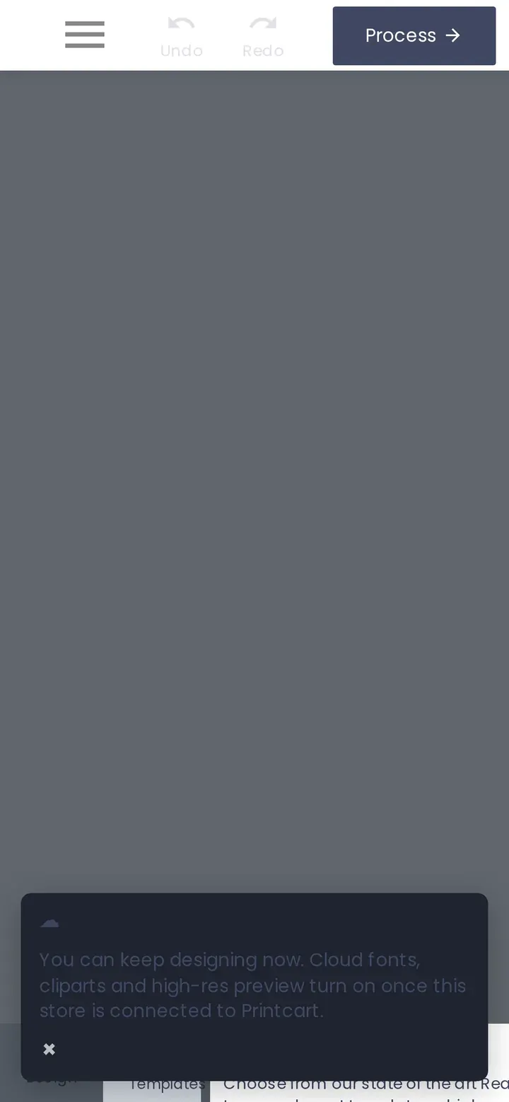
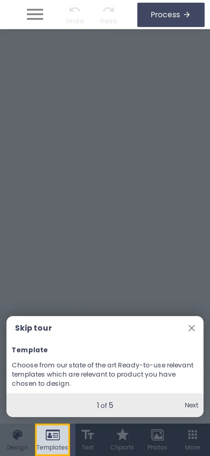
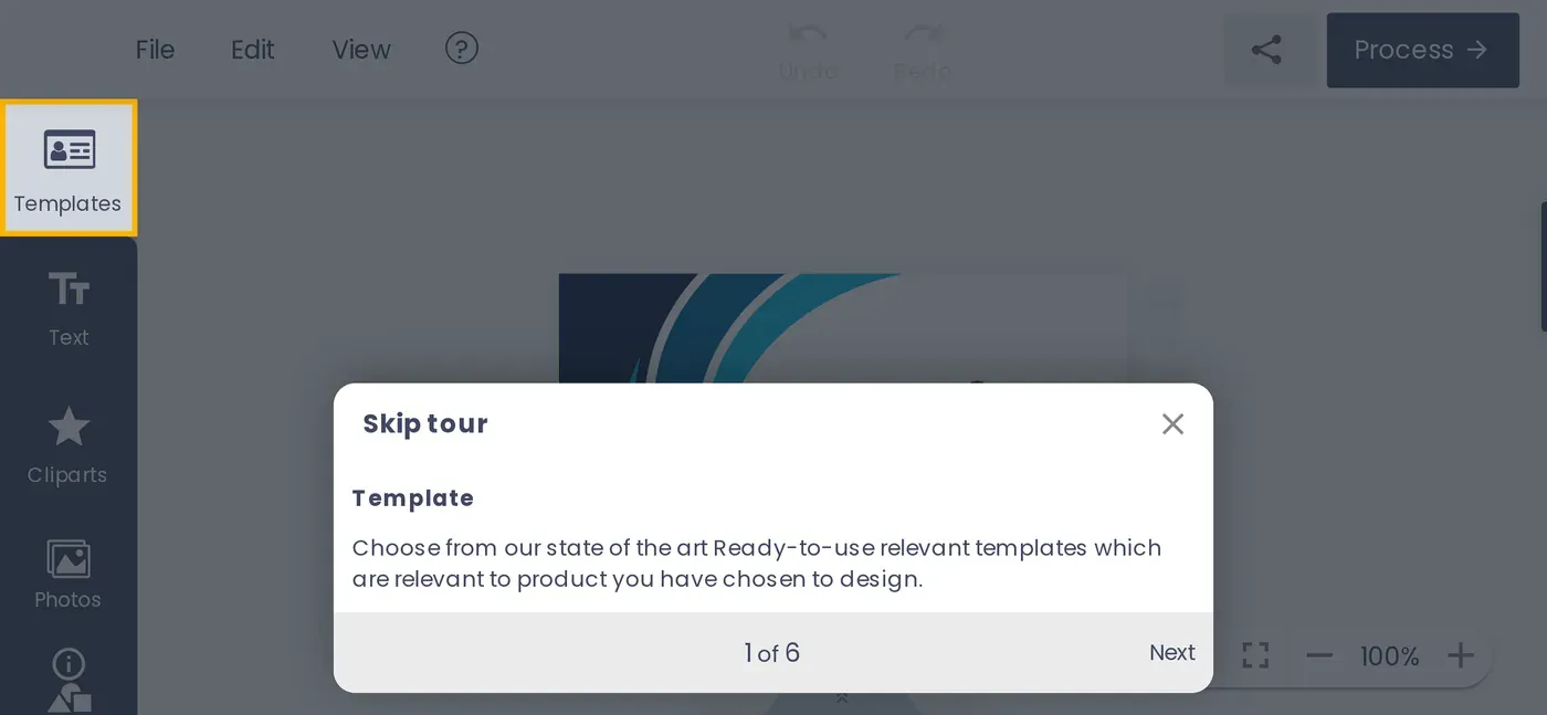
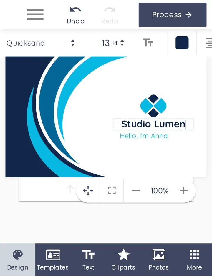
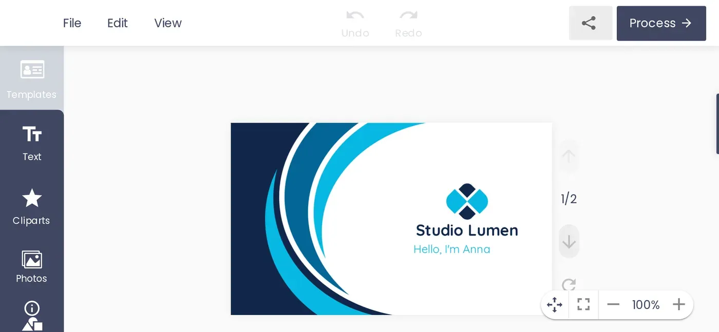
The screenshots below come from a test store with a business-card product (sample text "Studio Lumen / Hello, I'm Anna"). They were taken at iPhone 13 size (390x844) and on a small Android phone (360x800), before and after the update.
What changed for mobile shoppers in Printcart Store 2.11?
1. Store notices no longer cover the design tools
When a store is not yet connected to Printcart, the design tool showed a "Connect Printcart" notice. It floated over the bottom tab bar and hid the Design and Templates tabs, and shoppers saw it as well. Now only store managers see it. On a phone it is a slim strip above the tab bar with a large close button, and closing it hides it for 7 days.
2. The tab bar fits every phone, with a More menu
On a 360-pixel Android screen the tab bar ran off the edge and the Photos tab could not be reached. The tabs now share the width in equal columns. Tabs that do not fit, such as Elements and Layers, move into a More sheet.
3. The first-run tour can always be skipped
The welcome tour placed its tip next to the highlighted tool. On a narrow screen the Next and Close buttons ended up past the right edge, and the dark overlay blocked the whole editor. On narrow screens the tour is now a bottom sheet with Skip tour, Close and Next always visible. Tapping outside closes it, and steps for desktop-only tools are left out. The tour appears in narrow desktop-class browsers, such as a tablet in split view or "Request desktop site". Phone browsers go straight to the editor.
4. Every control is large enough to tap, and typing no longer zooms the page
Many toolbar icons were 24-28 pixels, well under the 44x44 pixel minimum that Apple and Google recommend for touch. Toolbar, zoom and colour controls now have 44x44 tap areas, and the icons look the same. Text fields use 16-pixel text, so iPhone Safari no longer zooms the page when a field is tapped. The colour picker opens as a bottom sheet with larger swatches.
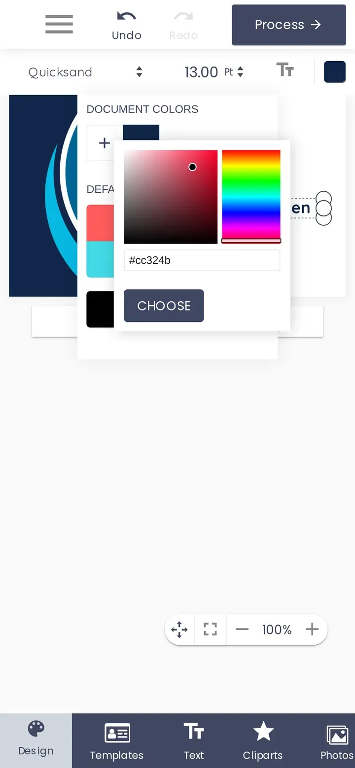
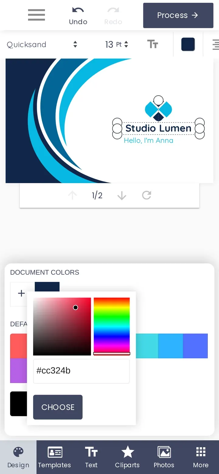
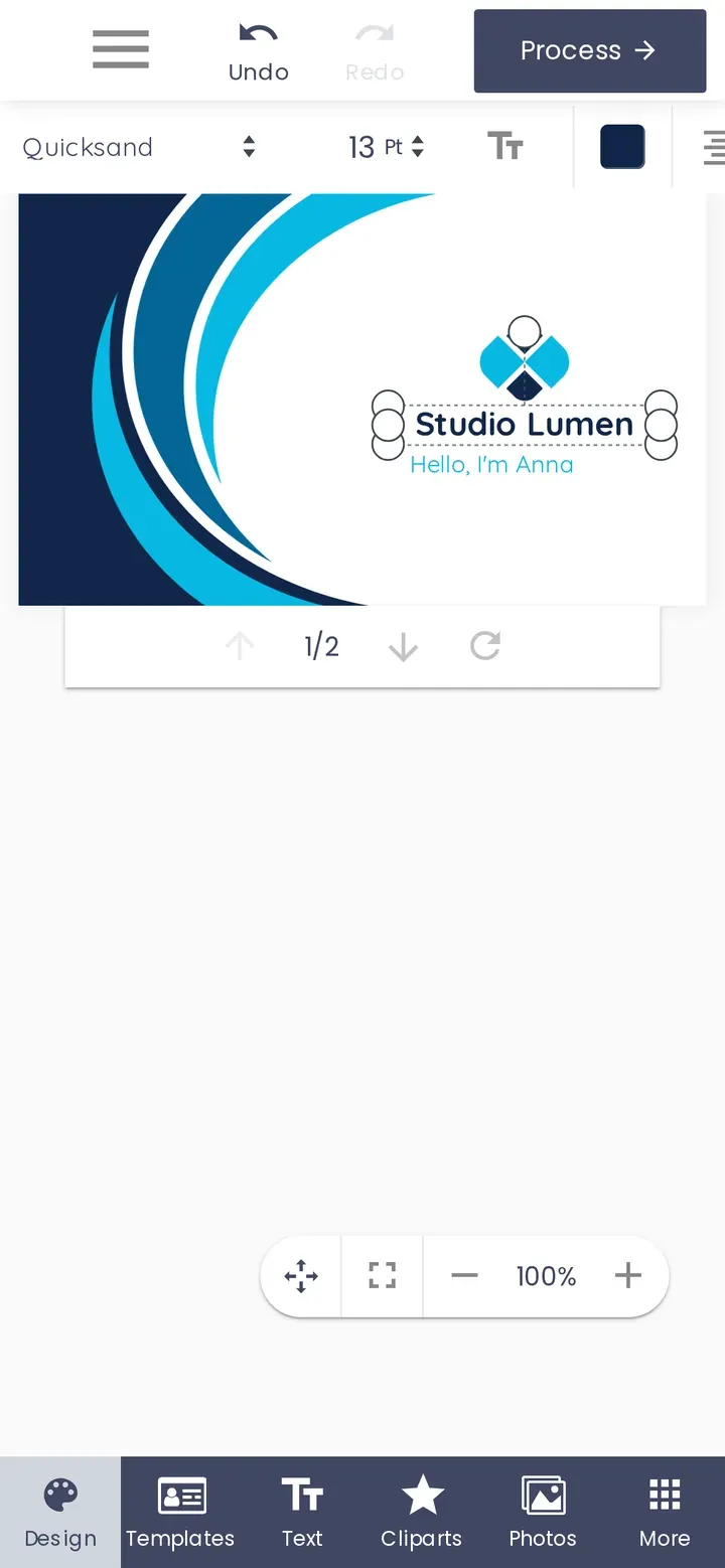
5. The text toolbar stays visible while typing
When the on-screen keyboard opens, only about half of the phone screen is left. The text toolbar now stays in view above the keyboard, so shoppers can change font, size and colour while they type. The font size shows one decimal place on phones.
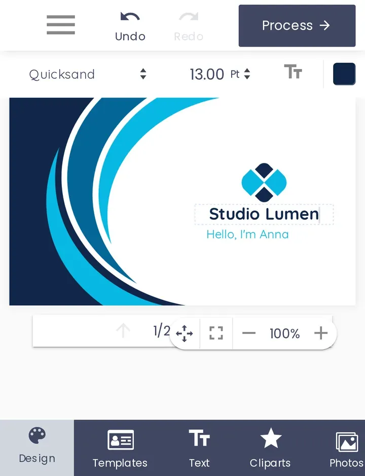
How do you enable the mobile-friendly designer on your store?
- Update the plugin. In WordPress go to Plugins and update Printcart Store to 2.11.0 or later. The mobile changes apply to the modern design tool layout.
- Turn the phone block off. In the plugin settings (General tab), set Hide design editor on smartphones to No. If it is Yes, phone shoppers still see the "not supported" page instead of the editor.
- Clear caches. If you use a page cache or CDN, purge it so phones load the new stylesheet and script.
- Test on a real phone. Log out, or use a private tab, then open a product with online design enabled and follow the checklist below.
Checklist: test your designer on a phone in five minutes
- Open a designable product and tap the design button. The editor loads with no notice covering the tabs.
- Tap every tab at the bottom, including More. Each one opens its panel.
- Add a text, double-tap it and type. The page does not zoom, and the text toolbar stays above the keyboard.
- Change the colour and the font size. The controls are easy to hit with a thumb.
- Upload a photo from the phone, drag and resize it, then use Undo.
- Turn the phone sideways and back. The design stays visible.
- Tap Process and add to cart. The cart shows the design thumbnail.
Frequently asked questions
Does this change the desktop design tool?
No. The changes apply only to screens 767 pixels wide or less. On desktop the editor is unchanged; we compared 20 desktop screenshots before and after the update and they were identical.
Can I switch the phone layout changes off?
Yes. Developers can return false from the nbd_modern_mobile_polish filter to switch off the phone layout changes (tabs, tour sheet, tap targets, keyboard handling). The rule that hides the store-setup notice from shoppers always applies.
Do I need a Printcart account for this?
No. The mobile improvements are part of the free plugin and work whether or not the store is connected to Printcart. Connecting adds cloud fonts and cliparts, AI tools and print-ready PDF output.
What about the classic and vista layouts?
These changes target the modern layout, which is the default for new stores. If you still use an older layout, switch to modern in the plugin's design tool settings for the best phone experience.
Printcart field note
What to verify before you roll out Mobile-Friendly Online Product Designer: Before and After in Printcart Store 2.11
This tutorial is written from Printcart implementation patterns across catalog structure, design controls, and customer personalization. Before treating it as complete, test the workflow with one real product, one real design file, and one real order path.
Mobile-Friendly Online Product Designer: Before and After in Printcart Store 2.11 — common questions
Why does the mobile experience of an online product designer matter?
A shopper who taps Design online has already decided to personalise the product. That is the highest-intent moment on the whole product page. If the next screen hides a tab, traps them in a tour or zooms the page when they type, they leave, and they usually do not come back on a desktop. Some stores switch the editor off for phones with the Hide design editor on smartphones setting, and customers then see a "not...
Does this change the desktop design tool?
No. The changes apply only to screens 767 pixels wide or less. On desktop the editor is unchanged; we compared 20 desktop screenshots before and after the update and they were identical.
Can I switch the phone layout changes off?
Yes. Developers can return false from the nbd_modern_mobile_polish filter to switch off the phone layout changes (tabs, tour sheet, tap targets, keyboard handling). The rule that hides the store-setup notice from shoppers always applies.
Do I need a Printcart account for this?
No. The mobile improvements are part of the free plugin and work whether or not the store is connected to Printcart. Connecting adds cloud fonts and cliparts, AI tools and print-ready PDF output.
Next steps in Printcart
Connect mobile-friendly online product designer: before and after in printcart store 2.11 with catalog setup, templates, production workflows, and implementation support.
Want to put mobile-friendly online product designer: before and after in printcart store 2.11 into practice?
Use the related Printcart tool below, or create a free account to start building with the product designer.